Where should you invest to beat inflation?
At 9% year over year, you can't afford to ignore inflation, you need an investment strategy. So what asset should you invest in to beat it?
Subscribe to the Ecoinometrics newsletter to understand Bitcoin and digital assets through the macro quantitative lens.
Why you cannot ignore inflation
Most investors haven’t had to worry about inflation for a long time.
I’m betting that’s the case for you too.
Unless you live in Venezuela, Argentina or Zimbabwe, or you started investing back in the 1970s, inflation has neither been high nor persistent enough to even be on your radar.
But times have changed. Just look at this chart of the inflation in the US. Not only is inflation at a 40 years high, it is simply high for the whole period for which we have data.
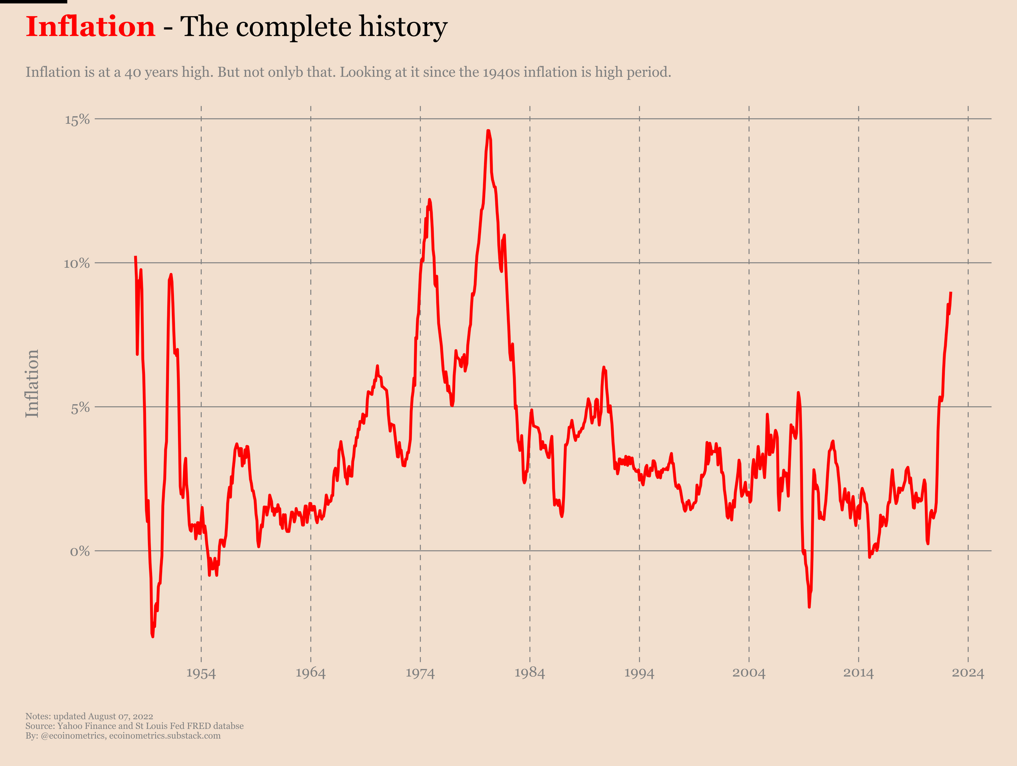
That’s bad especially if you remember that inflation is a rate of change. Meaning that inflation coming down means that prices will increase slower… not that prices will come down. That only happens when inflation gets negative.
But as you can see, since the 1940s inflation has been negative only a handful of times, never enough to compensate the previous price increases.
So your default position should be to think that those massive price hikes that happened over the last year aren’t going away.
Who knows how long this is going to last. But one think is clear, you can’t afford to ignore inflation when it comes to investing.
Why? Because of compounding.
Let me explain. Say you have $100k in cash. If inflation is averaging at 9% for the next 8 years, the purchasing power of these $100k is reduced to less than $50k.
Here is the compounding math.
When the inflation rate is at 9% that means whatever cash you started with a year prior is reduced to 91% of its purchasing power.
Said differently, $100k can only buy the equivalent of $91k worth of goods a year later. And that compounds over time.
Starting with $100k:
- After year 1 you are left with $91k in purchasing power.
- After year 2 you are left with $83k in purchasing power.
- After year 3 you are left with $75k in purchasing power.
- After year 4 you are left with $69k in purchasing power.
- After year 5 you are left with $62k in purchasing power.
- After year 6 you are left with $57k in purchasing power.
- After year 7 you are left with $52k in purchasing power.
- After year 8 you are left with $47k in purchasing power.
That scenario happened in the 1970s and it could happen again.
So just sitting on the bench and waiting it out isn't an option.
Which means the question is, what assets do you need to invest on to beat inflation.
We can try to answer that question by looking at what worked historically.
What assets beat inflation?
What do we mean when we say that an asset is beating inflation over a given period?
We are saying that this asset has been growing faster than the CPI over the same period.
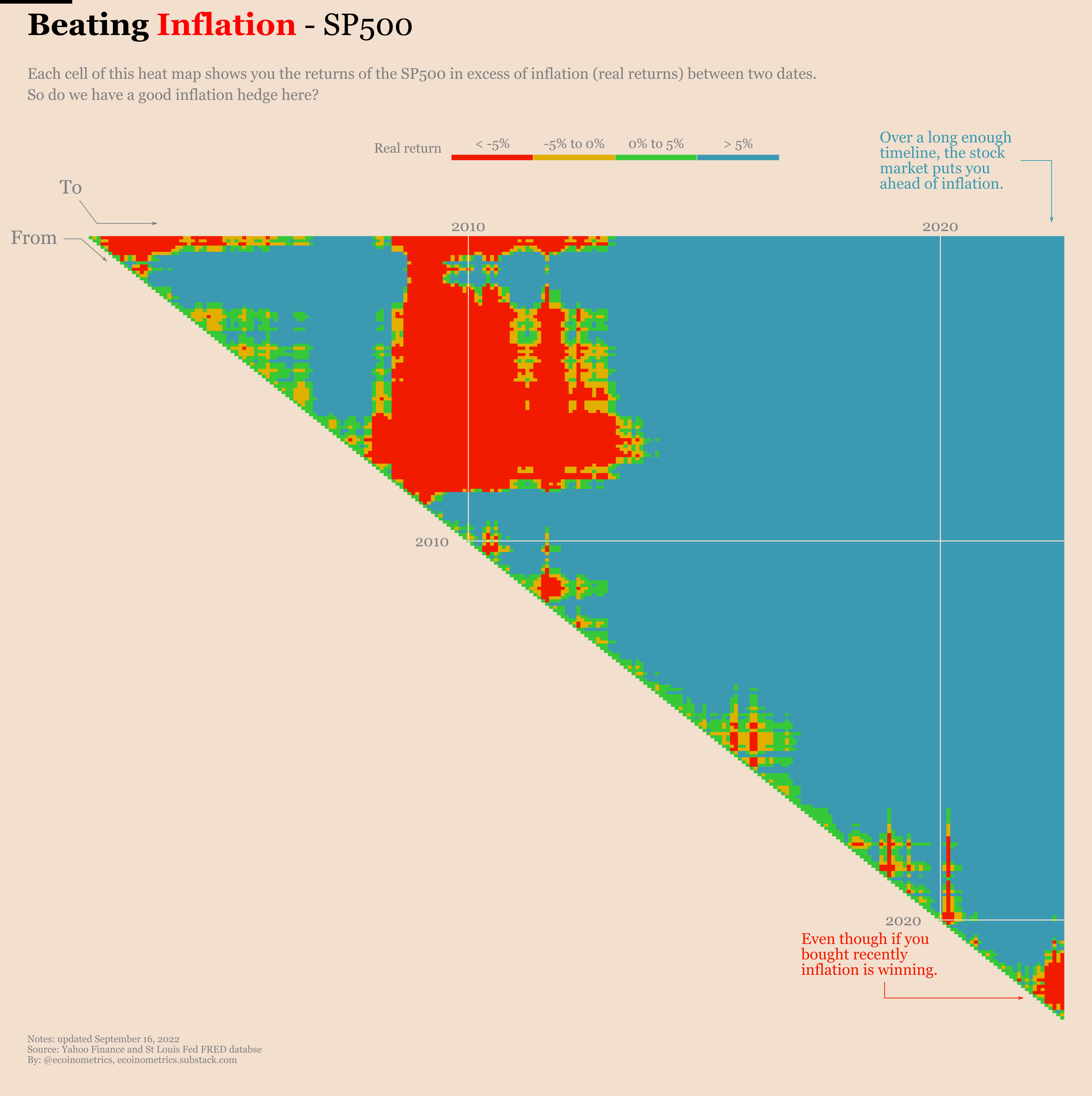
Say you are wondering how investing in the SP500 in 1998 did against inflation since then.
Well you can plot the total return of the SP500 and compare with the total growth of the CPI and see when the SP500 comes ahead. That’s what we have done below:
- The dashed red line represents the growth of the CPI.
- The solid line is the growth of the SP500.
- The growth of the SP500 is colour coded based on how its performs relative to the CPI i.e. based on its real return.
Take a look.
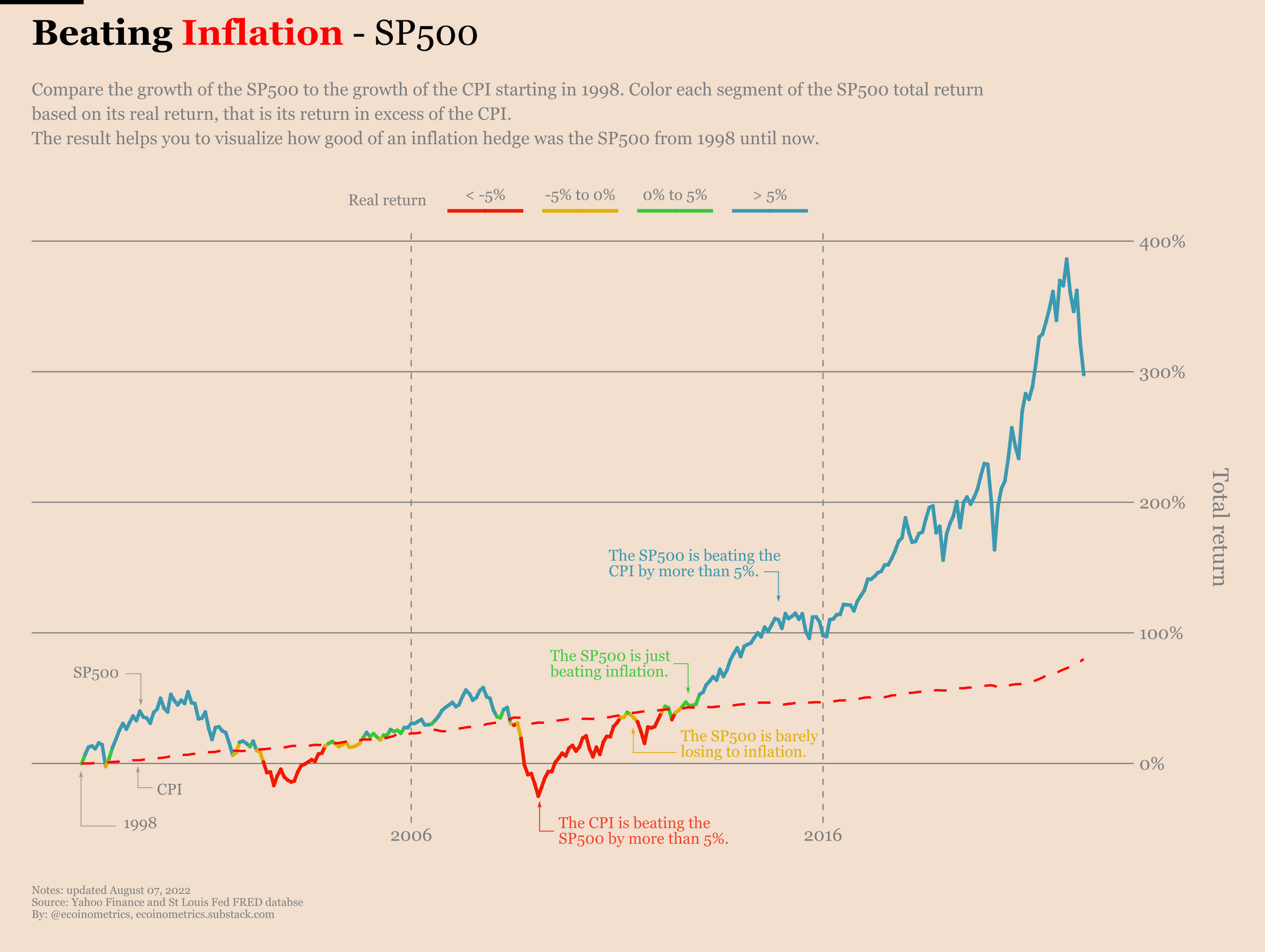
If you bought the SP500 in 1998 your real returns have been patchy at the start. The culprits are the crash of the Dotcom bubble followed by the Great Recession. But since then the stock market has been beating inflation easy mode.
Now that’s if you bought in January 1998. What about November 1995? Or January 1970?
To visualize all the possible starting points nicely we are going to take the chart above and keep only the colours that encode the range of the real return of the SP500.
Doing that we collapse the previous chart to this:
- On the vertical axis you get the starting point from which we compare the performance of the SP500 to the CPI.
- On the horizontal axis you get the time moving forward from the starting point.
- Reading the colour on any month tells you the real return of the SP500 for an investment from the starting point.
In the chart below we have only January 1998 on the vertical axis so the horizontal axis goes from January 1998 to June 2022. The colours are the same as the ones on the previous chart.
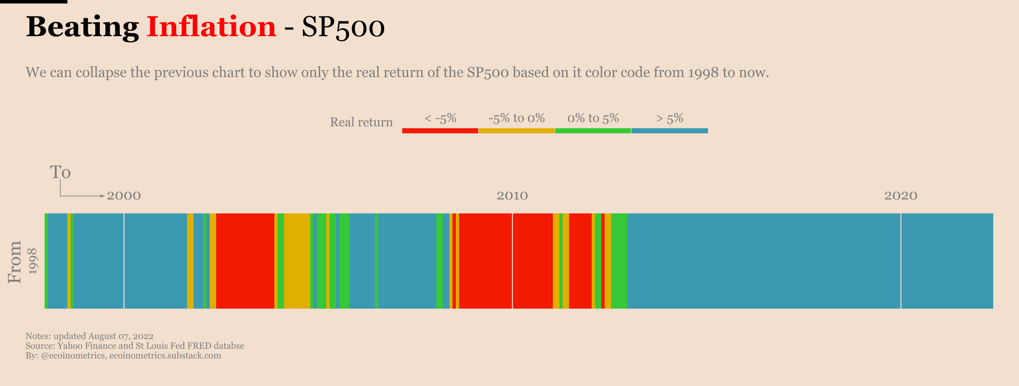
But now that we have collapsed the real returns to this heat map we can stitch together all possible starting points on a single chart. Check it out.
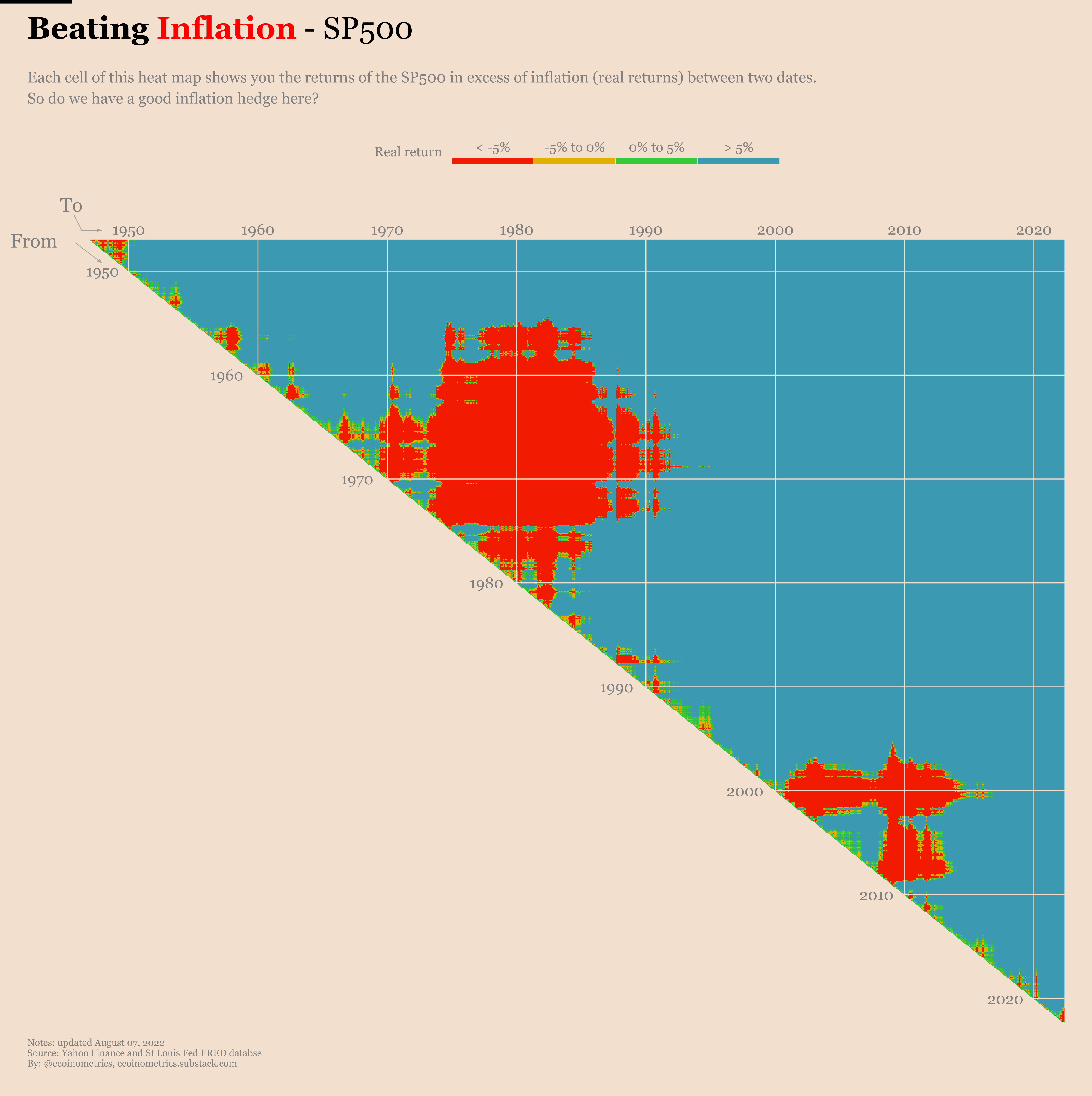
The colours still encodes the real returns of the SP500. Going along the diagonal on the vertical axis gives you different starting points. Pick a row and move along the horizontal axis to see how the real returns of the stock market evolved from the corresponding starting point.
Example. Move down the diagonal until you find 1960. Then read the corresponding row going to the right. From 1960 the around 1972 you see mostly blue which means that over that period the stock market is generating positive real returns way in excess of inflation. That’s what we like. But from 1972 all the way to the mid 1980s we are hitting a red patch. During that period the stock market fell behind in terms of real returns by a lot. Since 1985 though the stock market has recovered and stayed ahead of the CPI to this day.
Alright, so what can we learn by looking at this heat map?
If you look far into the right you pretty much only see blue. That means as long as you are considering long enough holding periods, decades in that case, the stock market gets you ahead of inflation. Yes there can be years where inflation is going to eat your lunch as we see with the red patches that correspond respectively to the high inflation of the 1970s, the Dotcom crash and the Great Recession. But for preserving the purchasing power of your cash for very long periods of time the stock market simply works.
Let’s zoom in a little bit and focus on the bottom right corner. This is gives you a view of the current situation. How is the stock market behaving with respect to inflation right now?
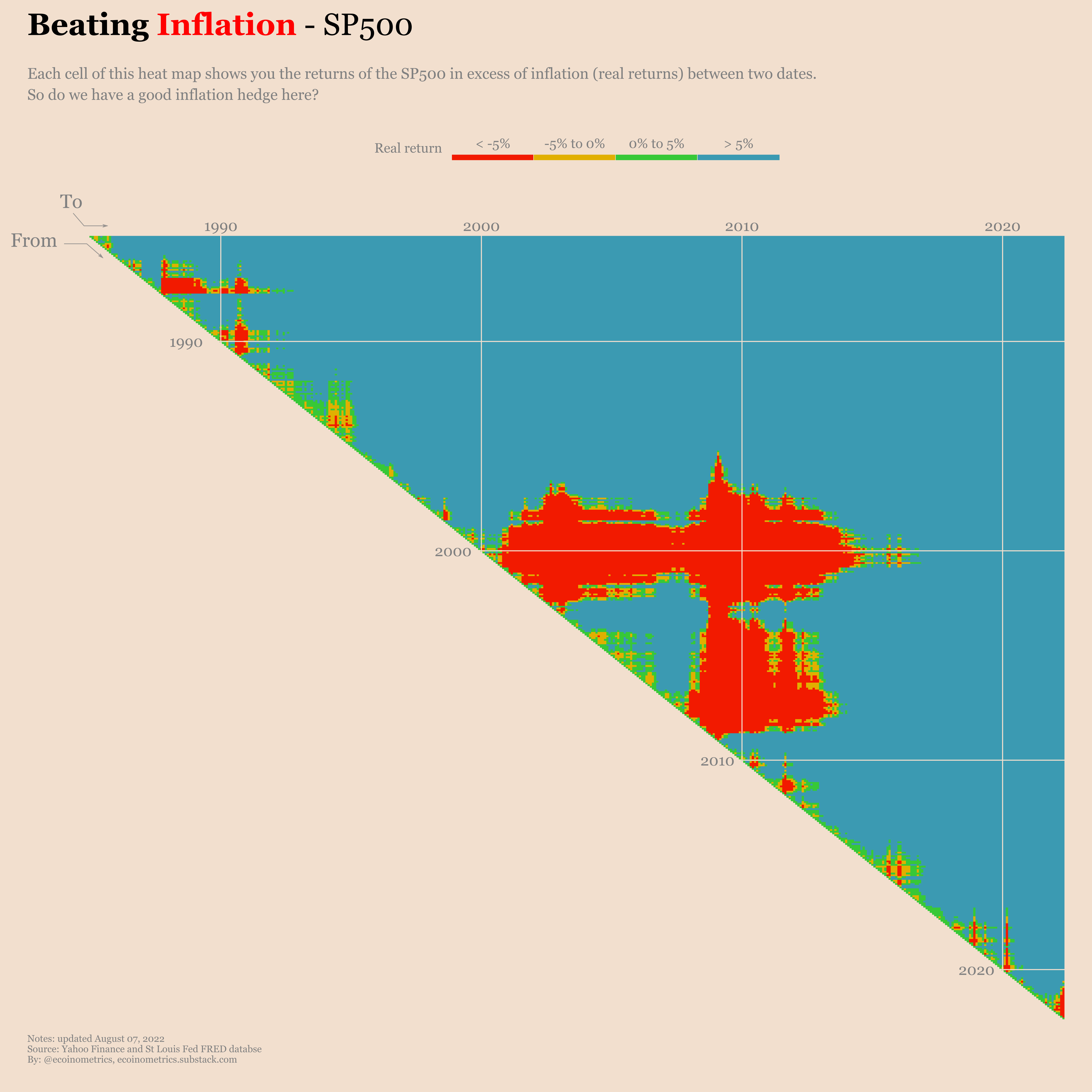
Basically if you bought in 2020 up to early 2021 you are good, blue all the way. But investors who got in the stock market after that are losing out to inflation.
That’s consistent to the pattern we are seeing in overall. In the short term there is no guarantee that the stock market can help you find inflation. Which means you can’t really say it is an inflation hedge against high inflation events. It is only useful for long term plays.
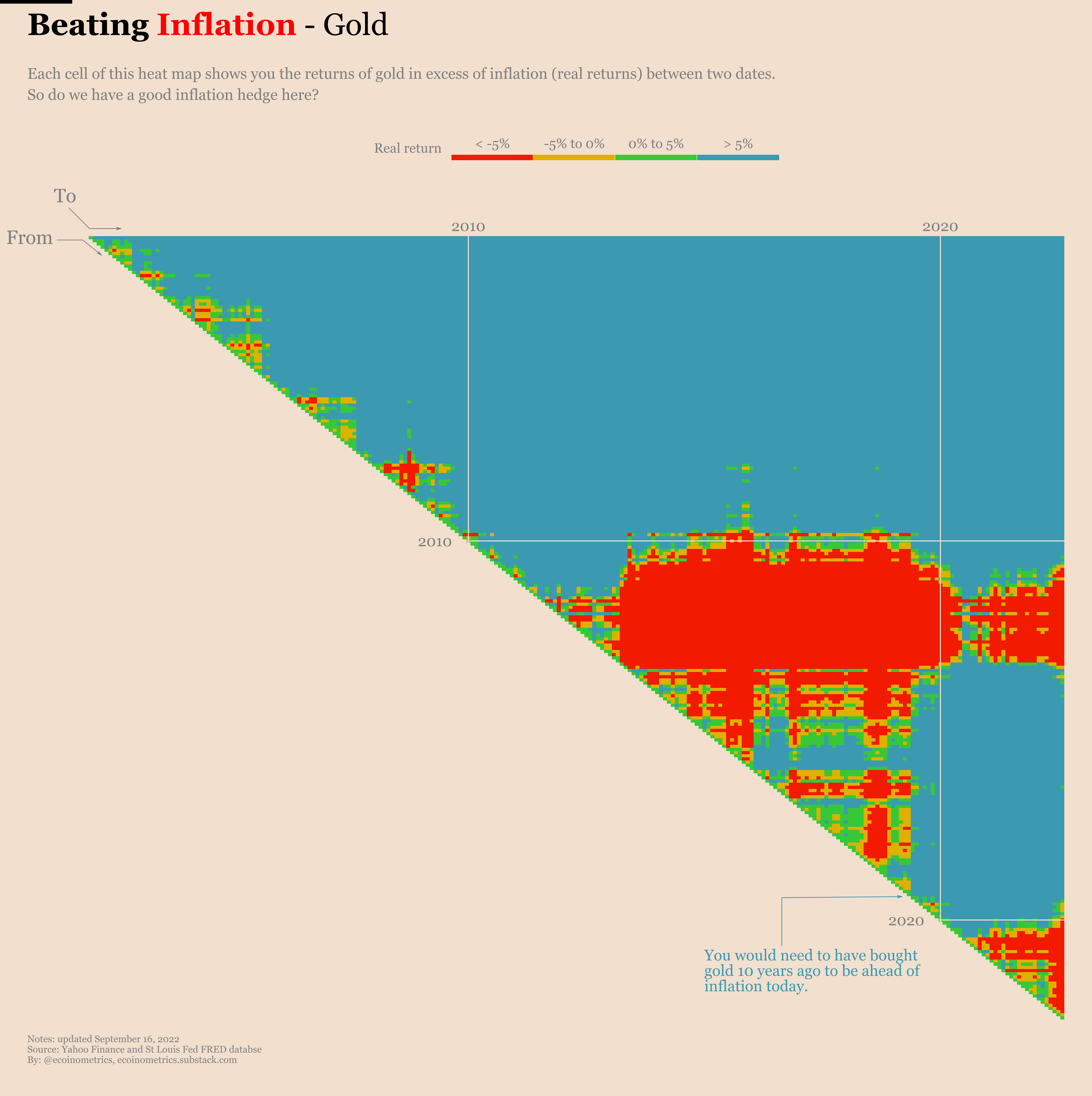
Ok, so if the stock market isn’t a short term inflation hedge, can we find something else to invest in? What about gold? Isn’t gold supposed to be exactly that?
Let’s have a look using the exact same method.
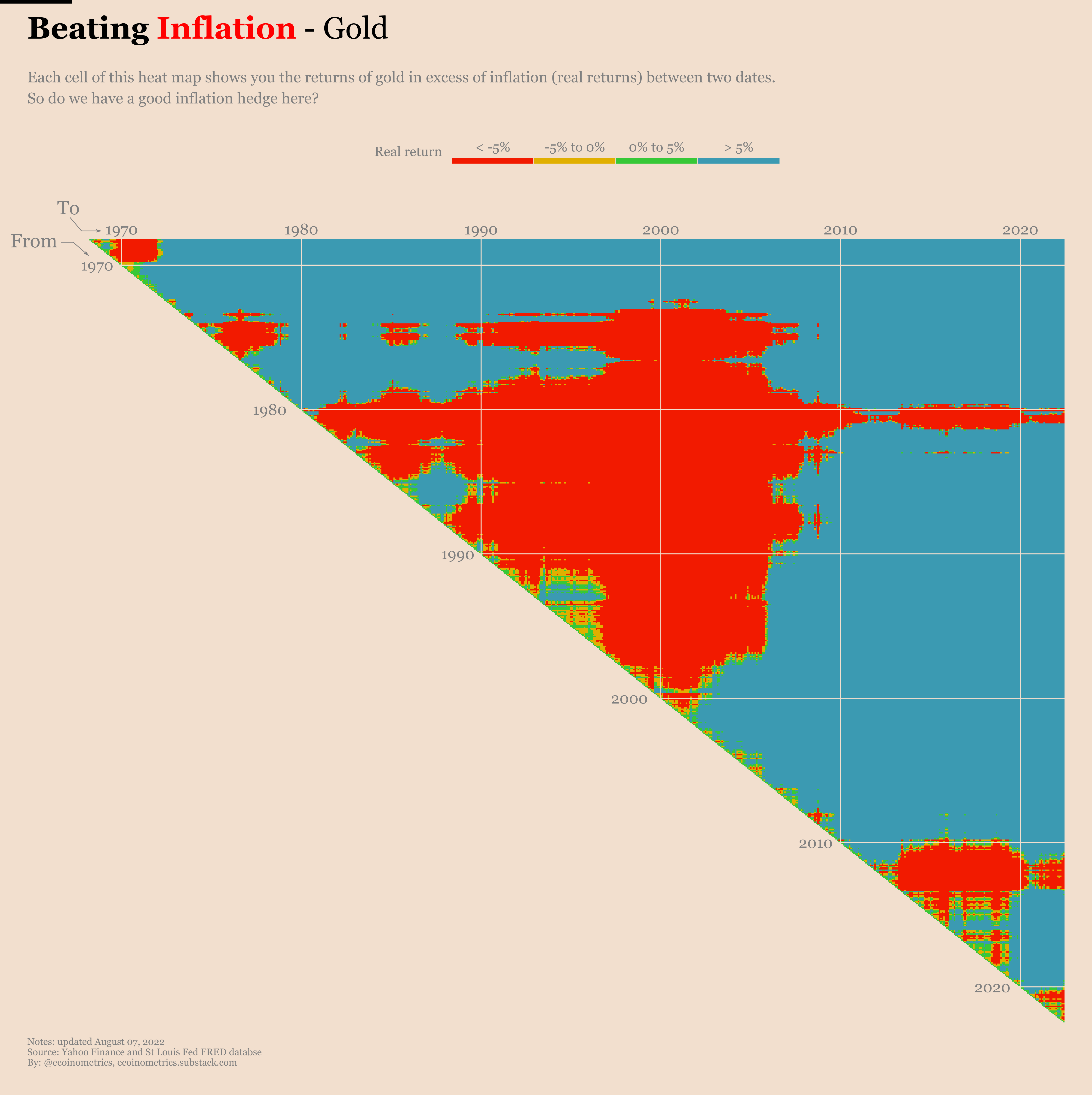
Wow! That’s a lot of red…
Staring at it closely though you can see that for the most part gold did pretty well in the 1970s. That happened to have been the last time we’ve seen a truly high inflation. So you could say that one this single event gold was a good short time hedge against inflation. By short time here we mean with a few years up to a decade time horizon. Because again, when compared to the stock market, we see a lot of red.
Now to be fair we haven’t had a period of high inflation like the 1970s since then. Until now. So let’s see how gold is behaving today.
Here is a zoomed in version of the gold heat map. Take a look at the bottom right corner. That’s the current situation.
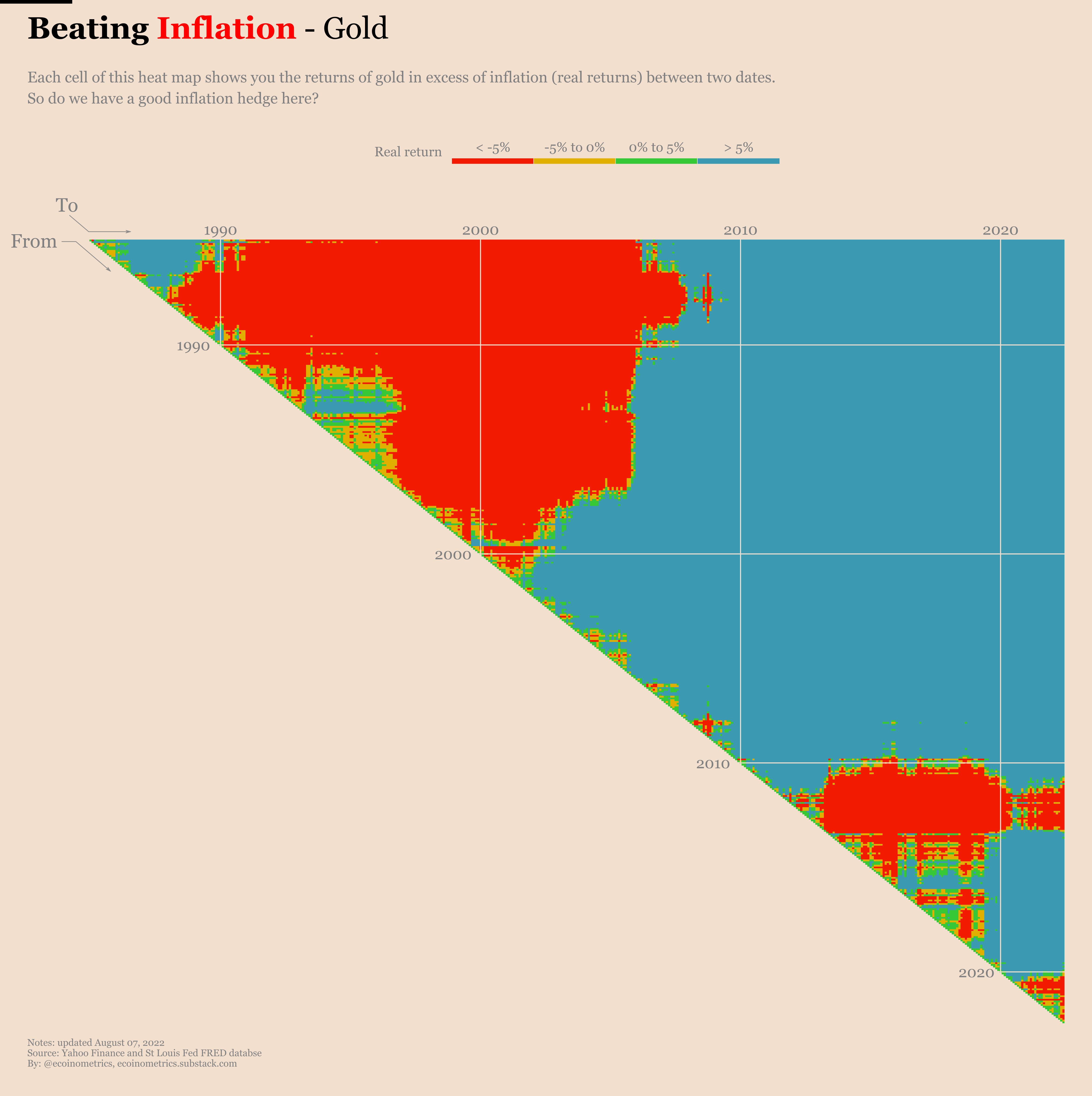
As you can see gold isn’t faring much better than the stock market over the last couple of years. Maybe things will kick in with a delay for gold, but so far it doesn’t look like a great inflation hedge. And if it is not a great short term inflation hedge maybe you are better of just sticking with risk assets like the stock market that seems more likely to protect your wealth on the long run.
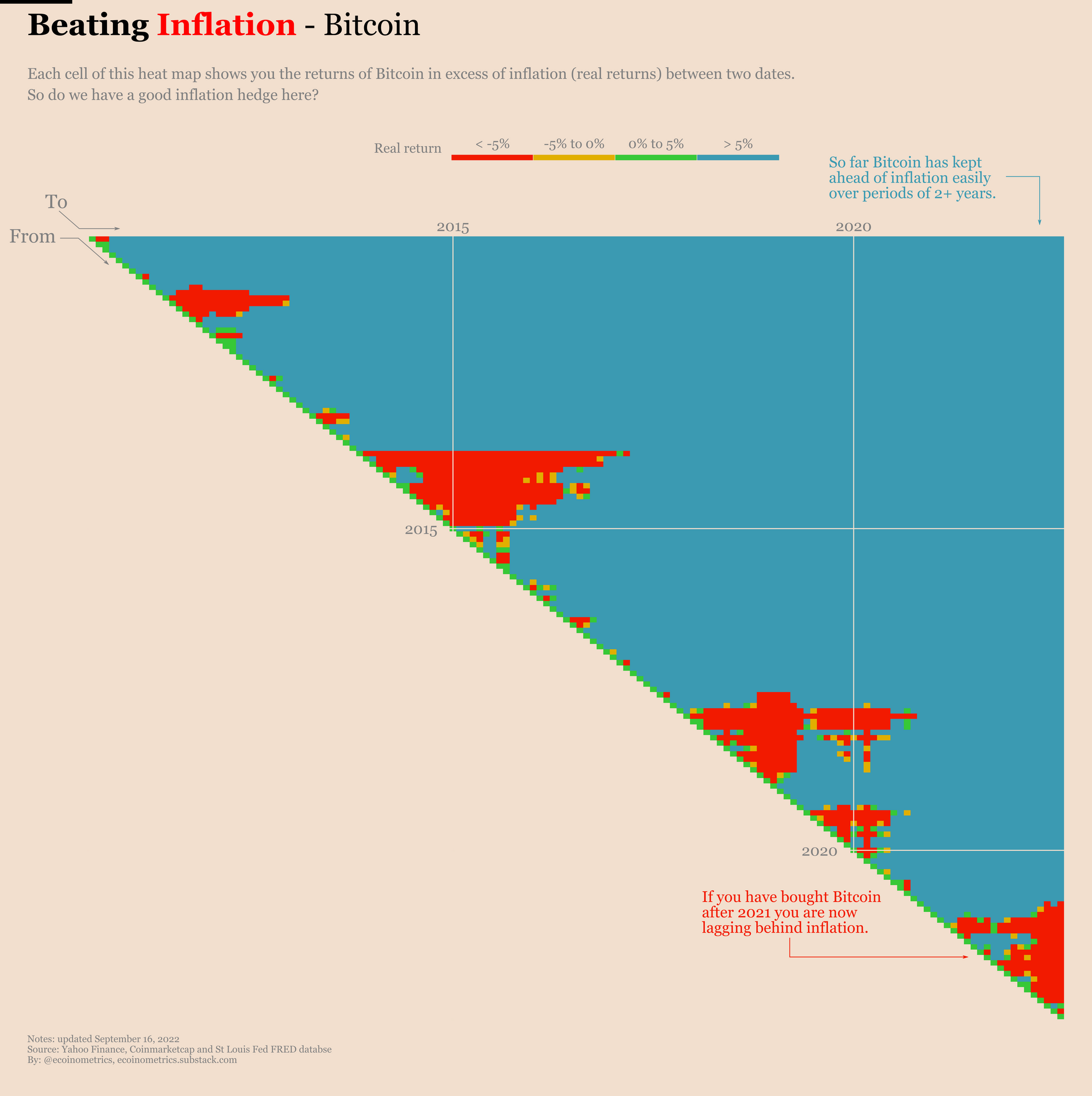
Now if gold doesn’t work out maybe you should give a try with digital gold aka Bitcoin.
We have less than 20 years of history on Bitcoin. Obviously that’s not a lot. Bitcoin was created at the time of the Great Recession and only started being priced in a liquid market sometimes in 2009. Since then this market has been dominated by periods of exponential growths followed large corrections.
Those periods of drawdowns are driving the red patches where inflation beats Bitcoin on the heat map.
See for yourself.
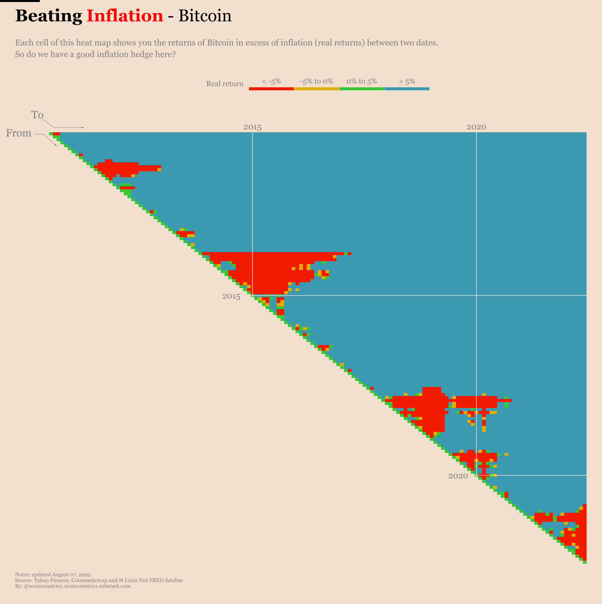
The interesting observation though is that all those periods where inflation beats Bitcoin are concentrated close to the diagonal of the heat map. What that means is that so far, if you have invested in Bitcoin over a period of more than a few years you have managed to stay ahead of inflation. It is a question to see if this will hold true in this bear market. But given the upside potential for Bitcoin over the long run, I like those odds.
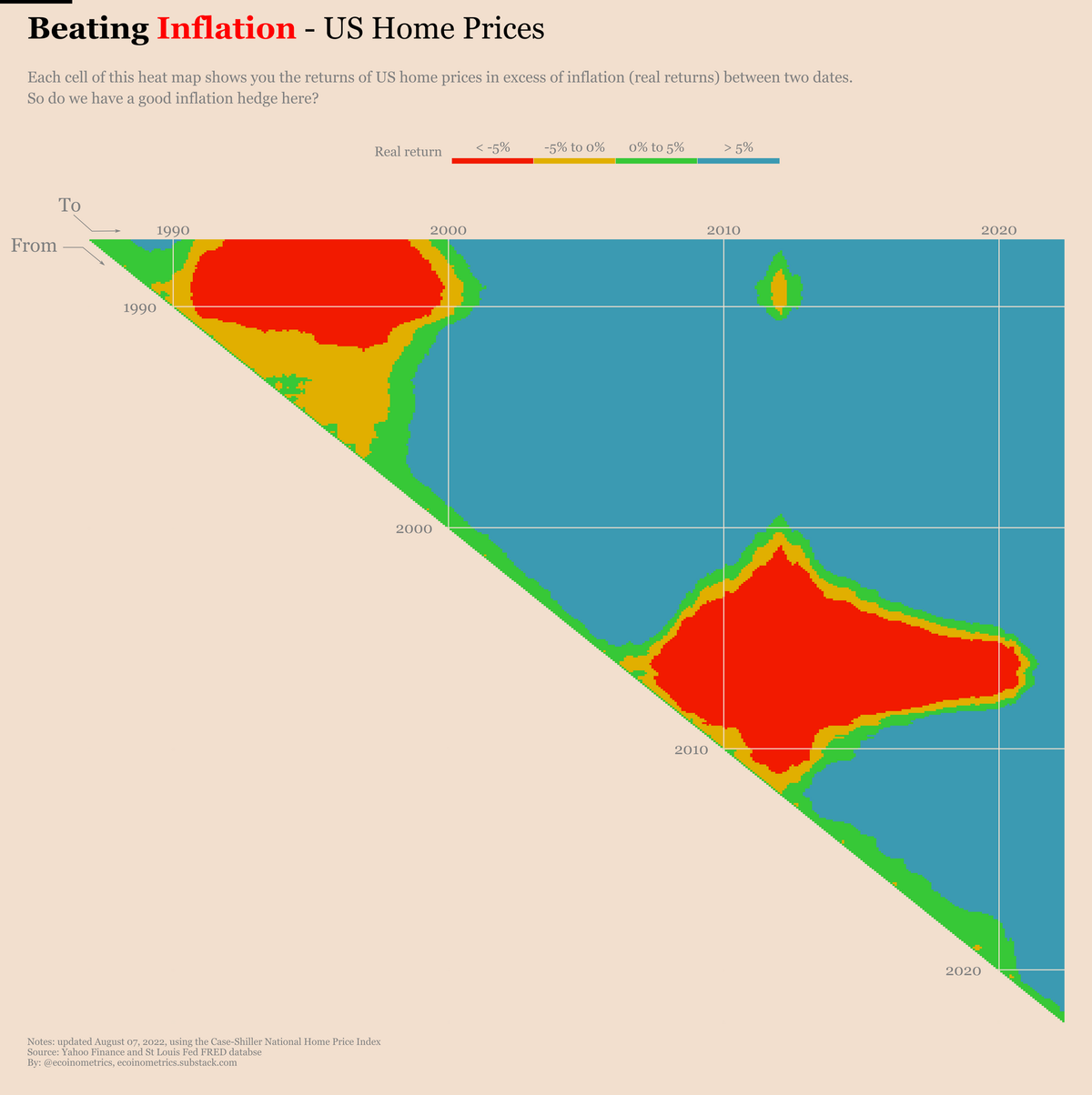
Another option to try to beat inflation is to invest in real estate. For sure that’s not as liquid a market as gold or the SP500. Still, it is liquid enough that it is worth considering.
Now the US housing market isn’t homogeneous. Coastal cities and large hubs have seen housing prices grow faster than the rest of the market. A detailed analysis would require to look at this at least state by state. But today we’ll settle on the big picture using the Case-Schiller index which represents a national average of the housing market.
Here is how it compares to inflation.

The data for the Case-Schiller index only goes back to the mid 80s. But it doesn’t look too bad. Yes it was hit big time by the Great Recession. However that makes sense given that the housing market was basically at the origin of the financial meltdown.
Look at the bottom right corner though. Whether you bought a house after the Great Recession or very recently, you have done better than inflation. At least that’s if you are on the good side of the Case-Schiller average.
All these examples so far are the kind of assets that you might consider to buy and hold long term.
But if you are thinking about hedging against periods of high inflation then maybe you can do something more tactical.
Think about it this way. Bouts of high inflation are usually rooted in higher commodities prices. Nowhere is it clearer than when you look at oil prices. Everything in this world runs on crude oil. You need crude oil for agriculture, manufacturing, transportation of the production of the previous two and also for your own car when you are going to purchase those products or when you go to work.
Said differently crude oil touches almost everything. Which is why energy prices are a crucial component of inflation. So why not get at the root of it. Buy crude oil to hedge yourself against surges in inflation.
How did that work out in the past?
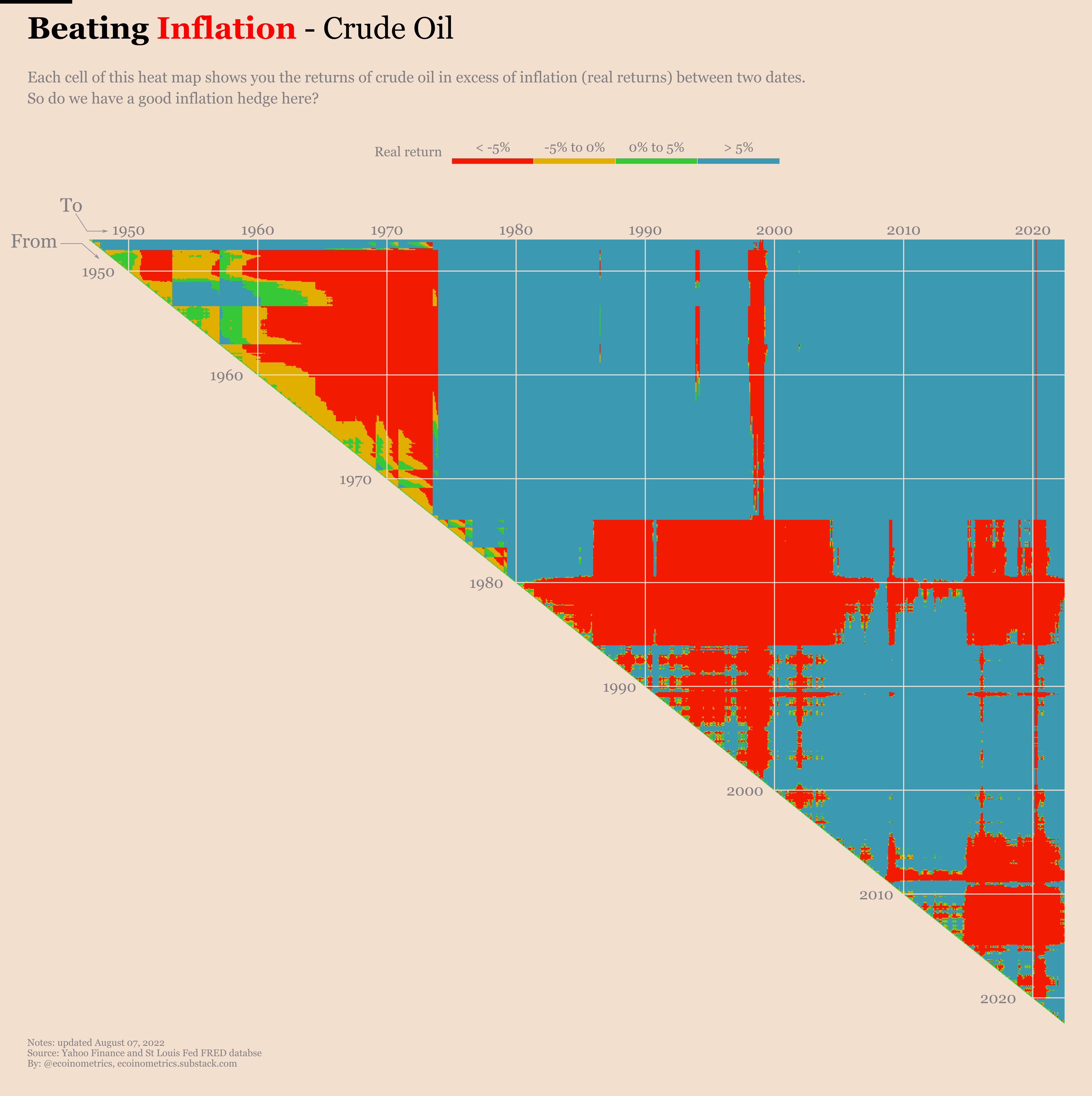
Focus your attention on three places:
- The 1970s.
- The 2000s up to the Great Recession.
- The bottom right corner which is right now.
During those three periods we had some surge in inflation that was driven in big part by oil prices. And what do you observe on the heat map?
If you stay close to the diagonal (start of each period) you get a lot of blue. That is in the short term buying crude oil does give you a hedge against surges in inflation.
But crude oil is volatile enough that there is no guarantee it will help over long periods of time. Which is why you need to be tactical about it. Identify the inflation risk, jump in the trend early, do sell when you are far enough ahead. That’s what you need to do in that case. Easier said than done…
So I guess we can stop there we our tour of how a range of assets behave against inflation.
The moral of the story is that there is no silver bullet asset that will beat inflation every time. You need to know what you want to achieve.
What history suggests is that at the two extremes of time horizon:
- Risk assets offer no guarantee in the short term but do beat inflation over long period of times (decades).
- Commodities, especially energy, can be used as tactical plays to hedge against an inflation surge. But they require that you time your position carefully.
Who is beating inflation right now?
The inflation data is released on a monthly basis in the US. We will thus update this page every month with the latest real returns data.
So don’t forget to bookmark this page if you want to see the latest updates. And subscribe to the newsletter to be alerted when the newest charts are released.
The headline inflation rate for August 2022 move down to 8.3%. Historically speaking that's exactly the median drop. At this rate it will take a couple of years to meet the 2% target.
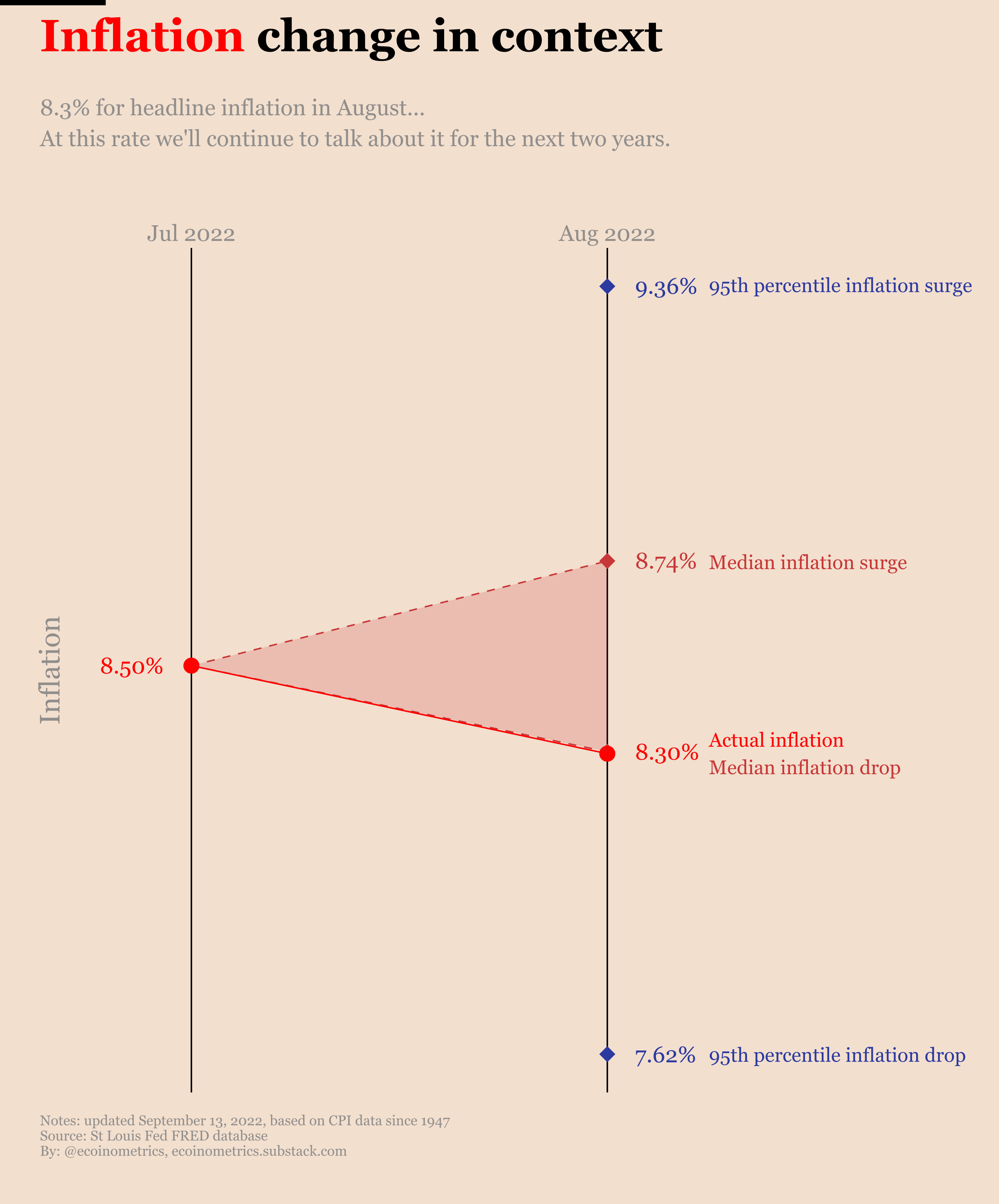
Still while the headline inflation move lower, the core inflation which excludes food and energy moved higher again this month. That's a sign inflation is sticky and the Federal Reserve needs to continue being aggressive with its quantitative tightening policy.
Obviously that's bad news for risk assets.
That being said even though Bitcoin and the stock market haven't been good inflation hedges over the last few years, the situation is even worse for gold.
That's another reason to bet on risk assets such as Bitcoin or the stock market if your goal is to beat inflation over the long term.
Subscribe to the Ecoinometrics newsletter to understand Bitcoin and digital assets through the macro quantitative lens.